

Although the REACH law on chemicals does not cover waste as such, it does affect recycled products which rely on secondary raw materials extracted from waste. At the end of the day, recycling companies might find it difficult to comply, holding back the EU's drive to consume less raw materials, says Wobbe van der Meulen.
More »One could argue that the marketplace is become more democratic than it’s ever been. All of the awareness that the Occupy movement brought forth, might just be ready to “trickle down” into the marketplace.
The post How Sustainable Consumerism Might Change the World appeared first on Triple Pundit: People, Planet, Profit.

‘ITO JAKUCHU INSPIRED’ is a celebration of japanese art history and important masterpieces created by the great japanese artist of the edo period,
ito jakuchu (1615-1868) . the designboom competition in collaboration with DA, japan’s design association and tokyo designers week 2012,
has been full of symbolism, addressing the cultural phase of our existence.
humanity has gone through two opposing developments: the first in which society was fully integrated with nature; the second,
being how it expanded into an artificial world of its own, which continued to grow until it came in conflict with the natural world.
the competition asked participants to develop contemporary works relating / referencing the creations of ito jakuchu,
expressing ways in which humanity should / could now reconcile and unite nature and artifice, resulting in a new balance through
the mediums of architecture, interior design, product design, graphic design, art, media art, photography, illustration, fashion design,
textiles and film….
the winners were chosen by a japanese jury – directed by toyo ito – that was composed of members very much aware of the traditions
and practice of ito jakuchu and the significance he has had on japanese culture through the generations. with their expertise we trust their beliefs
and understanding of the artist’s philosophies and respect their verdict of the shortlisted projects. however, the range of works that were submitted
were impressive and designboom feels that many more of the entries which are not featured here, deserved to be showcased. perhaps too radical
in their means of expressing the true essence of ito jakuchu – we spotted crazy furs with jakuchu derived animal prints, furniture pieces which
draw on the two-dimensional works of the artist, as well as digital translations of his work… – we wish we could have showcased all of these
in the exhibition during tokyo designers week where the winners were revealed.
thanks to all those who participated in our ITO JAKUCHU INSPIRED competition.
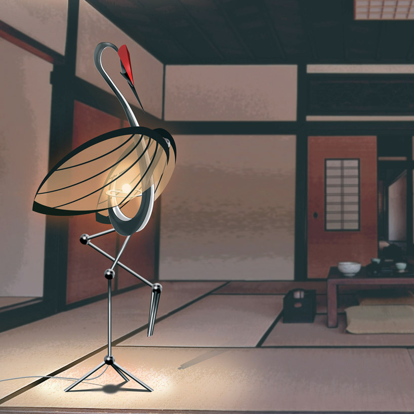
1st place winner
‘R.C.C. floor lamp’ by tommaso balladore, italy
first place winner is italian designer tommaso balladore’ with his ‘R.C.C. floor lamp’. it brings to life ito jakuchu’s famous cranes.
the animal becomes the structure of an illuminated sculpture, made with an aluminum frame supporting wings in semi-transparent paper
which act as a light diffusion filter. a simple touch of the beak turns the light on and off.
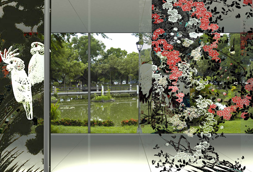
2nd place
‘through ito jakuchu’s eyes’ by djordje alfirevic + sanja simonovic, serbia
there is a dematerialization of boundaries between ito jakuchu’s perception of the reality in which he lived and the appearance of our modern world.
this is reflected in the second place winners’ entry by djordje alfirevic + sanja simonovic from serbia: the exhibition pavilion’s ‘mirrored walls’ invite
visitors to observe not only the pieces on show inside the pavilion but also the natural realm of its spatial context, … as if one where looking ‘through ito jakuchu’s eyes’.
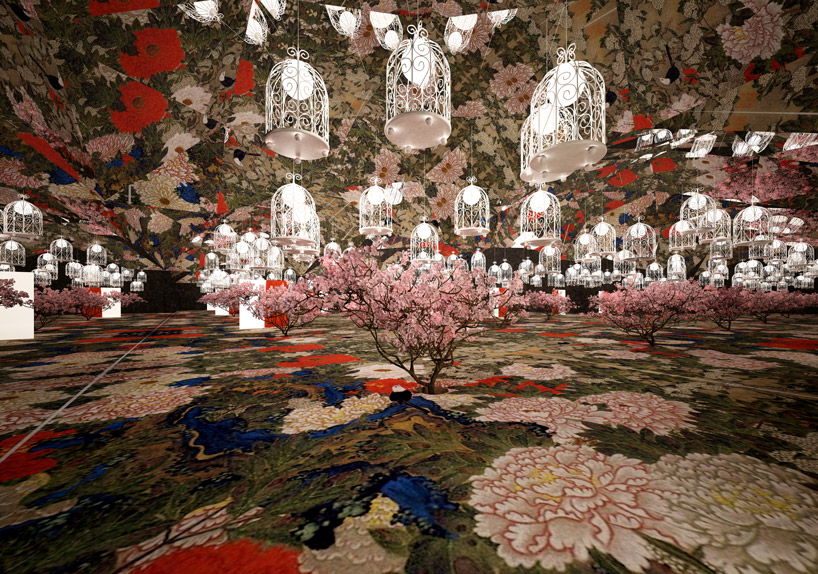
3rd place
‘kaleidoscope’ by ann wigandt, moldova
ex-equo third place winner, moldova-based designer ann wigandt’s main idea is to bring ito jakuchu’s artistic oevre back to life through an installation similar
to a ‘kaleidoscope’ from which the work draws its name. in a small enclosed room, the visitor finds himself surrounded by a diversity of colors and details
represented by ito jakuchu’s brushstrokes. the printed artwork on the floor is reflected by the many faceted mirrors that hang from the ceiling and on all walls.
blooming trees, lamps in form of birdcages and flying butterflies complete the overwhelming sscenography.
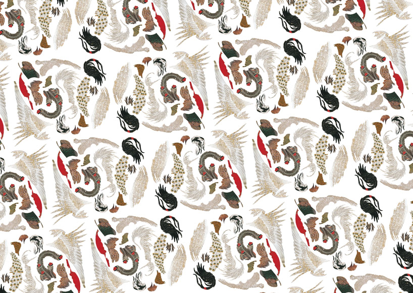
3rd place
‘feather textile’ by nanako tani, japan
the second ex-equo 3rd place winner is the japanese designer nanako tani. her entry ‘feather textile’ showcases the bird plumage of ito jakuchu’s
paintings, repeated countless times in a pattern that symbolizes the eternal life force of the birds. vivid colors can be attributed to ‘movement’ and
as a result, the arrangement of feathers become more than just a natural element of the animal’s wing.
see the 20 shortlisted entries below:

‘make jakuchu’ by saida dalmau + benet dalmau, spain
saida dalmau + benet dalmau from spain have developed ‘make jakuchu’ – where random acts and the spontaneous participation of citizens
result in a collaborative artwork. to accomplish the temporary piece, paper rolls are trimmed in the style of ito jakuchu’s as origami shapes,
distributed in urban spaces. by cutting pieces of the paper into these forms, they serve as a template to paint patterns on the walls and floors
of our concrete jungles.

‘building parallel cities to cure my soul’ by santo cereixo, spain
the idea behind spanish designer santo cereixo’s ‘building parallel cities to cure my soul’ is to use art as a medicine to cure spiritual wounds –
to build a parallel town which could help us erase unwanted memories and bad experiences from our minds. cereixo imagines the
spanish fishing village of muxía – the final site in which pilgrims making their trek to the way of st. james - as his selected location.
a clean and safe place to live free of corruption, cereixo visualizes how muxía could be if its vacant lots and decrepit buildings act as a canvas
for which murals of ito jakuchu’s natural scenes are depicted.
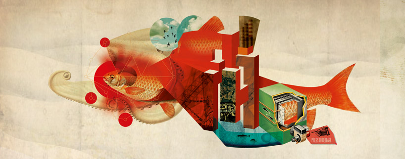
‘press to release… ‘ by nuno andré neto santos, portugal
‘press to release… ‘ by nuno andré neto santos of portugal is a narrative illustration that merges the industrialized world of man,
with the natural essence of our planet expressed through animals such as fish. the digital collage has been rendered following buddhist ideas
which ito jakuchu often expressed in his painting. though it is shaped by a complex structure composed of both mechanical and artificial elements,
the work still evolves into something representative of nature, reminding us that we must remain conscious of our impact
on the future of the world – where machines could ultimately be the devices to free us and unify our spirit with the flora and fauna that surrounds us.
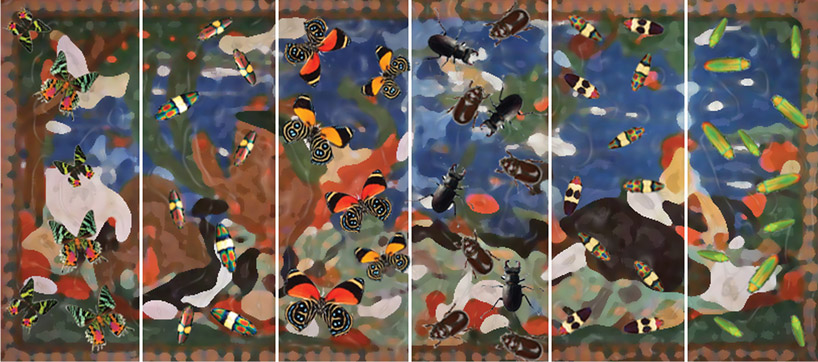
‘natural kingdom’ by joseph louis tan + madelyn yeo, singapore
joseph louis tan + madelyn yeo from singapore have created an assemblage of some of the world’s most curious and exquisite bug specimens
collected from the remote jungles – from south east asia to africa to south america. their piece ‘natural kingdom’, is a display in which peculiar insects
are arranged on panels of beautiful patterns – some of which are simple, while some are exceedingly complex – offering a psychedelic juxtaposition of elements,
resulting in a multi-layered visual work.
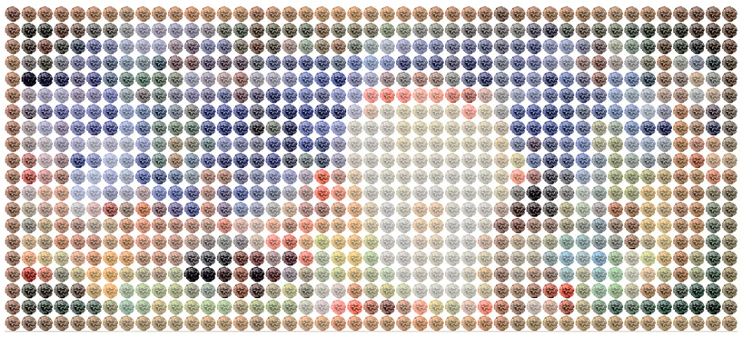
‘painted flora / unnatural natural’ by madelyn yeo + joseph louis tan, singapore
after conducting investigations on people’s perceptions of ‘domestic nature’, yeo and tan’s other shortlisted entry ‘painted flora / unnatural natural’
is a result of their interpretation of these thoughts visually. through scientific exploration and photographs which touch on themes of manipulation and perfection,
the duo’s two-dimensional piece can most obviously be understood as an abstract work of art, but upon closer inspection and understanding,
an actual depiction of our inhabited world.
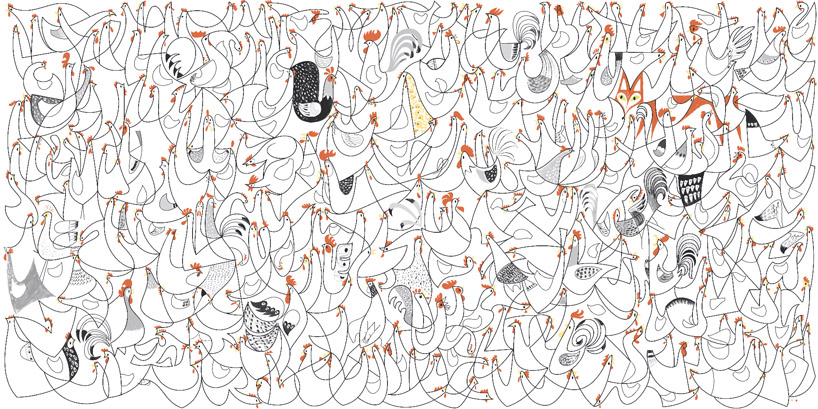
‘niwatori & kitsune’ by naomi hasebe + achilles greminger, japan
‘niwatori & kitsune’ is influenced by and meant to be a contemporary revival of ito jakuchu’s ‘roosters’ painting.
developed by japanese team naomi hasebe + achilles greminger, the fowl are laid out in a geometric diagonal pattern
as a means of bringing order to the chaotic illustration. the angled lines bring movement, while the overall repetition of the motif
offers a sense of unity. overlapping bodies give an illusion of depth in the otherwise flat work, with a fox camouflaged into the design -
the carnivorous considered an enemy of the chicken and is hiding in the buzz, quietly waiting the awakening and imagination of the observer.
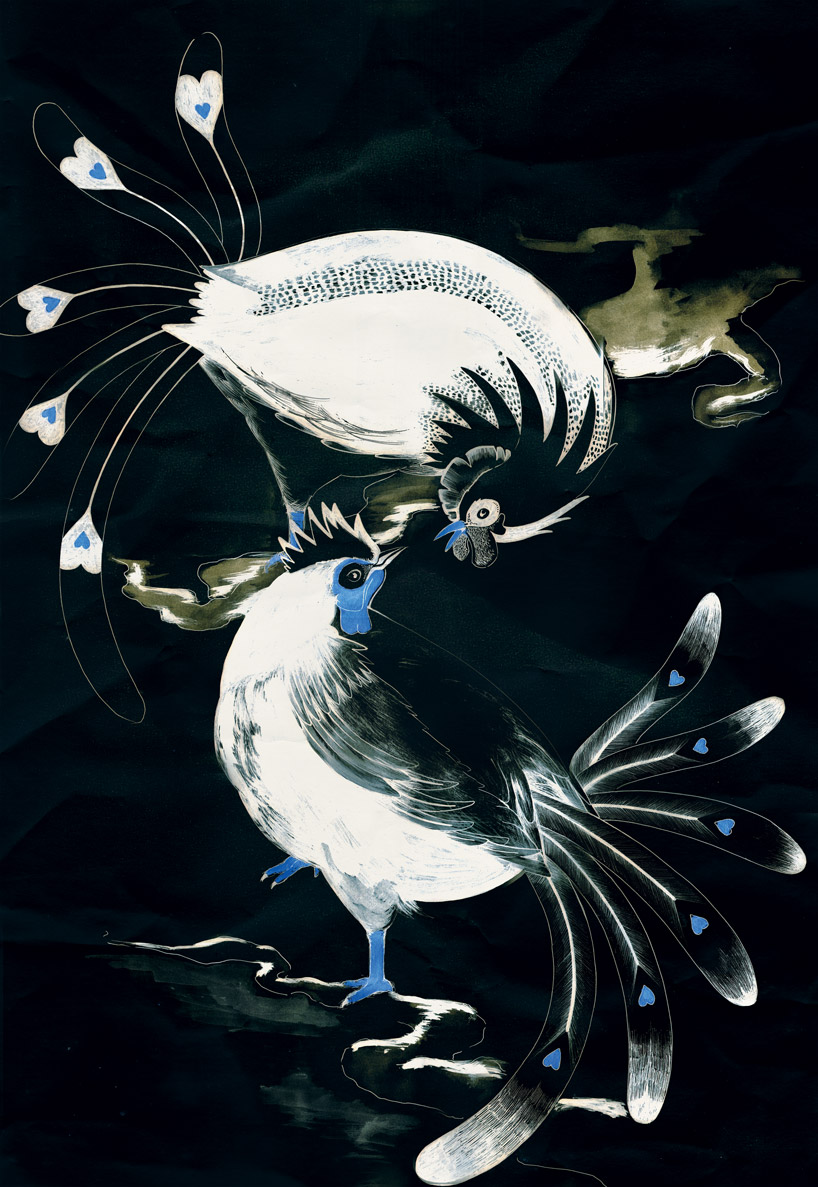
‘strange attractions’ by ana félix, portugal
‘strange attractions’ by ana félix is an illustration in which the portuguese designer tries to capture the moment in which two male roosters realize
the presence of one other. being of the same species, natural attraction between them is present. this magnetism is counterbalanced by the fact that
the two are dominant characters, creating instead a scene of opposition. the result is a harmonic balance that expresses the simple and
complex interactions that exist in nature.
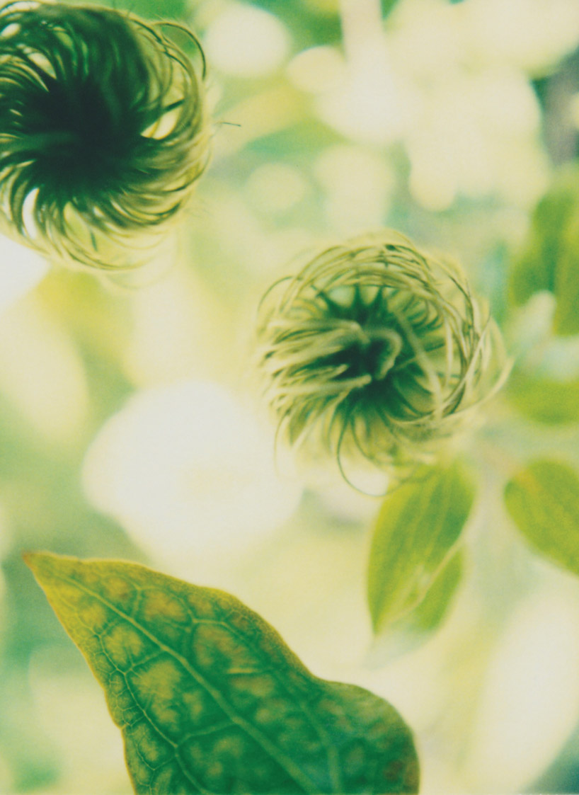
‘hanayo’ by charles west, USA
the origin of ‘hanayo’ by american designer charles west begins with a desire to take large format photographs, influenced by karl blossfeldt and ito jakuchu.
one lesson that can be learned from his images is that there is no up, down, right or left; the only direction is towards the light. the radical compositions
and unfamiliar scenes in the ‘hanayo’ series are primarily the result of flowers’ ruthless orientation towards the sun.
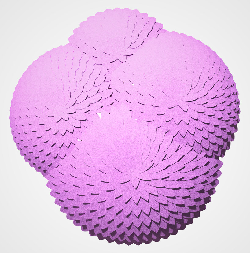
‘jakucha’ by amir zobel, israel
‘jakucha’ by israeli designer amir zobel is a hand-held parasol whose form draws on the element of layers of ito jakuchu’s works which depict
bird feathers and flower petals. the sculptural object stands to represent a connection between the past and the present; between tradition and industry;
and between natural phenomena and commercial products. made out of traditional japanese materials – rice paper and wood –
the complex three dimensional structure of ‘jakucha’ has been designed using advanced CAD tools. its blossom-like appearance
explores the way in which nature can be described and reconstructed artificially through mathematical equations.

‘moja paperweight’ by shuhei senda, japan
shuhei senda’s ‘moja paperweight’ draws on ‘shinki’ – the mysterious existence of the spirit – that ito jakuchi tried to find in the rooster.
the design object is a PVC hexagonal paperweight which is enigmatic in appearance, an aggregate of irregular curves.
here the paperclip is re-born into a new artifact which has a strong presence. it is produced through the simple way of coiling
the cut hexagonal mesh into a functional work of art.

‘life-egg’ by kenji akiyama, japan
the first moment in which people recognize something, is when that object comes into existence. ‘life-egg’ by kenji akiyama of japan uses
ito jakuchu’s attention to every detail to draw pictures – precisely because he thinks that all things have a certain viability.
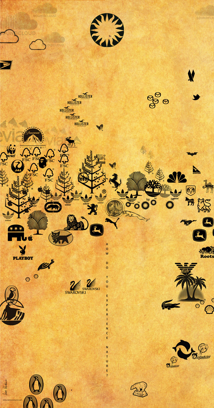
‘how do you experience nature?’ by ian perkins, singapore
with more of the earth’s population living in cities, people are coming in contact with nature less and less – their main experiences
are through pictures and branding, only a representation of the beauty of the natural world which they are missing out on.
‘how do you experience nature?’ by ian perkins of singapore uses a scroll format in reference to ito jakuchu’s works,
in which he uses modern icons of nature – corporate brand logos – arranged into a landscape, suggesting that this is the only natural phenomena
much of our society experiences from day to day. the arrangement of these well-known symbols in this way, reminds us of what we are actually missing.
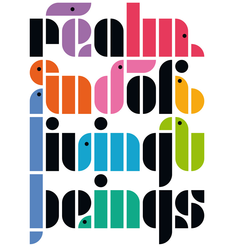
‘unity’ by monica fraile morisson, france
‘unity’ by french designer monica fraile morisson is a tribute to ito jakuchu expressed in a modern, bold and colorful typographic interpretation.
her modular typography of animal profiles – elephant, pelican, birds, snake, turtle, bear and anteater – communicated through the phrase ‘realm of living beings’,
demonstrate a certain level of togetherness, through the combination of geometrical shapes and wildlife depictions.
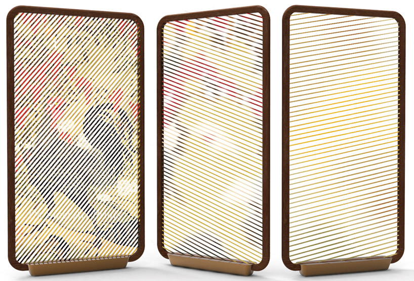
‘ito screens’ by jess fügler, usa
‘ito screens’ by american designer jess fügler are influenced directly by the process ito jakuchu used to create his paintings –
he applies color to the panels which first appear as conceptual notions, further developed into detailed subjects.
though the paintings are two-dimensional, they are filled with depth that reflect our natural world. by positioning the different layers
of the ‘ito screens’ within a space, the user is able to manipulate their environment. within the wooden frame the dyed fibers form
an abstract image of nature creating an artificial reality.

‘ito jakuchu art gallery’ by pule swai, switzerland
the ‘ito jakuchu art gallery’ by pule swai from switzerland is an experiential work - a place of reflection. the cantilevered structure
invites visitors up its stairs, across land and over water, a large skylight introducing air as another element into the space.
the volume draws its form from roosters often seen in ito jakuchu’s work, supported by two oblique steel beams that counterweight
the ends of the building. the ‘beak’ element plays a structural role, extending the lobby outwards. the facade’s wooden tiles create the
wings of the construction, with brass/copper plates for the neck and head. the interior has hints of colors which were used by
ito jakuchu.
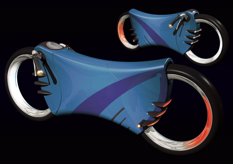
‘cricket’ by arkadiusz szenfeld, poland
‘cricket’ by polish designer arkadiusz szenfeld is a concept vehicle that integrates nature – the form looks like a cricket –
with the power of the motorcycle. the unseen air within the two-wheeled means of transport affords it to sway and glide.
the fresh air is like ‘shinki’ (the mind of god), that fills the design’s empty body with natural and clean energy.
‘cricket’ is dedicated to people who want to create balance and live in a harmony with the natural world.
the more motorcycles powered by clean energy, the less polluted our cities are.

‘kensy’ by camila hincapie + camila hincapie castillo, colombia
‘kensy’ is a chair suitable for any home that is influenced by the magnificence and suspenseful themes of the art pieces ‘wild goose and redes’,
‘golden pheasant in snow’, and ‘mandarin ducks in the snow’ by ito jakuchu. conceived by colombian designers camila hincapie + camila hincapie castillo,
the seating object aims to reconcile the link between nature and manmade things. balance and a sense of equilibrium arise as the furniture pieces
emerges from earth and undergoes a metamorphosis into a functional design.
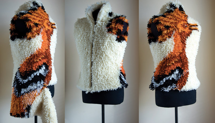
’2 in 1 natural faux fur vest’ by heli miikkulainen-gilbert, ireland
’2 in 1 natural faux fur vest’ is a woolen garment by irish designer heli miikkulainen-gilbert which takes influence from ito jakuchu’s cranes -
from the painting ‘birds and animals in the flower garden’ – who in real life are said to spend their lifetime with one partner.
in terms of a display, jakuchu’s six-fold-screen painting is more than just a regular painting. this vest is a functional ‘2 in 1’ piece; under the tuft,
in the horizontal cut at the hip there’s a hidden durable metal zipper which can be used to adjust the length of the hem to go with any outfit,
for any occasion.
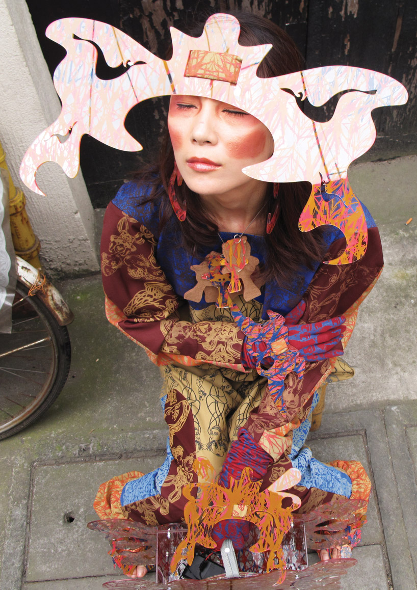
‘(wear if you dare)’ by alexandra avramova, china
‘(wear if you dare)’ by china-based designer alexandra avramova is influenced by ito jakuchu’s ‘birds and animals in the flower garden’.
the garment collection aims to reflect the vibrant colors and magical atmosphere of the original artwork. the pieces are made of hand-printed
acrylic resin resembling the shapes of animals concentrating on their wings, horns and ears.
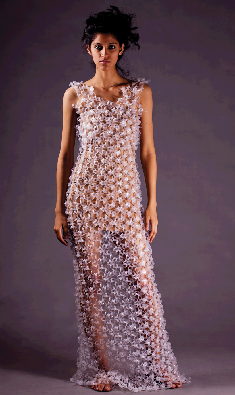
‘ātman category – fashion design and textile’ by palash singh, india
like ito jakuchu’s paintings, ‘ātman category – fashion design and textile’ by indian designer palash singh metaphorically reveals ‘inner beauty’,
concealing the human body with this garment. the dress is made by joining modules of laser-cut transparent recyclable plastic together to form a fabric.
each unit consists of slits and protrusions which allow the elements to be fastened into each other. the structure twists, turns, tessellates and joins
endlessly to form the work. the entire fitting has been done by sole geometry without any external links or finishing.
The post ITO JAKUCHU INSPIRED competition results appeared first on designboom.
As the world is going on a rapid change, the effect is seen on various aspects of living. Eco friendly homes have taken new turns, are loved by people, as they are stylish, and sustain more energy. Home construction companies from all across the world are promoting eco friendly living as a part of initiative to save the environment. Nat Zero homes are getting popular into use especially into the lower country region. Experts are stating that, the Nat Zero homes have created a niche in the market and have boomed the green home segment. Started from the year 2011, Nat Zero homes have become one of the most popular choices for living. The program manager of green homes have stated that, since 2011, the percent of share in the overall eco home market is just 17%, but by the year 2016, it will surely rise to the mark of 38%.
Nat Zero home concept is different from other eco friendly home designs as the homes are installed with alternative energy systems. When the concept was initiated in the home building sector, it was only available for those who wanted to get customized eco friendly homes. However, with time, it is taken into use at large along with which has become one of the most preferred choices of eco friendly homes for use. Two renowned names in the construction industry and archrivals, Nexus energy homes of Maryland and Amerisips Homes from Charleston have already started working in the segment of creating Nat Zero homes in the area of Johns Island and Summerville. Talks are on for starting the concept of Nat Zero homes in the area of Mount Pleasant. Even the project managers of both the companies are eager to start up the working process as soon as possible.
Below mentioned are some facts, which makes Nat Zero homes unique in every form.
Insulated structural panel is being taken into for creating the outline of the homes. Solar panels are also being installed so that energy can be conserved with ease. Along with this, geothermal process of cooling and heating the water is also taken into use for Nat Zero homes.
Heat pump and energy recovery systems are also installed in the Nat Zero homes to make them compatible for use.
The energy efficient homes will lower the electricity bills and will enhance the indoor quality of air. The structural framing of the homes are tough which are resistant to tremors.
Every brick that will be taken into use for creating Nat Zero homes are eco friendly, which means they are made up of recycled or recyclable products.
Experts from all across the world who are associated with eco friendly homes have stated that, concept of Nat Zero homes are gaining popularity as people are getting prone towards having eco friendly homes. Both the construction companies who are associated with building Nat Zero homes are relying heavily on this concept because once energy is stored, it will have enough power to last for twelve months with a result that you will have zero energy cost. Heads of both the construction companies involved in making Nat Zero homes have stated that, it be a super conventional home that will not require energy sources like other conventional homes.
The experts from the real estate industry are stating that, once the concept of Nat Zero homes will take its full flow, it will be even be initiated in industries who are looking for eco friendly offices so that they can control the cost and expenses. In addition, the experts stated that, Nat Zero homes is the future of eco friendly homes that would sustain in the end.
Industrial designer Yves Behar believes his revamped SodaStream can save 2000 bottles a year – but a TV advert promoting its green credentials has been banned in the UK for alleged “denigration” of rival products (+ watch the ad). (more…)
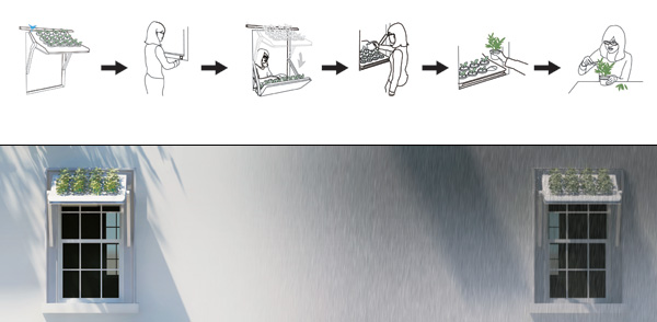
Herbow is a rain shelter and a window herb garden. A very unique and unconventional combination, but one that works! Given the way counties like Japan have been upping their efforts in going green by growing creepers and other such plants on their building’s external walls, to lower internal temperatures and conserving electricity, these kind of gardens suit the urban landscape perfectly.
Herbow is a window planter ‘tray’ that enables people to grow small crops outside their windows while shielding their interior space from the rain. By swinging Herbow upwards, it becomes a window shelter that blocks the harsh sunlight and the rain. At the same time, the plants are watered and grow naturally. An eave has been designed to extend over the shelter to stop water falling through the gap between Herbow and the window frame. Holes on two sides of Herbow allow for drainage of excess water.
Herbow is a 2012 red dot award: design concept winner.
Designers: Hsu Hao-Po, Chang Yu-Hui & Chang Chung-Wei


-
Yanko Design
Timeless Designs - Explore wonderful concepts from around the world!
Yanko Design Store - We are about more than just concepts. See what's hot at the YD Store!
(Herbed Windows was originally posted on Yanko Design)
Related posts:
Most of the people picture old and worn out jackets or sweaters in the dumpster but Sam Palmer and Jennifer Feller are definitely not among this lot of people as they are the ones who thought of using the old fleece jackets to make brand new covers for the digital gadgets like iPads. Isn’t making Kindle cases and iPad covers a much better option than simply throwing the jackets away and lets face it, they look amazing and very innovative! ReFleece is basically small design company established by Sam Palmer who happens to be a onetime IDEO design engineer and Jennifer Feller who is the better half of Sam Palmer.
This design company set up by the both of them focuses on making products from a new type of upcycled felt. The recycling procedure followed at ReFleece is somewhat different from the typical process as it ignores re-melting at high temperature and shipping which makes their process a low energy consuming process and that is definitely a good thing. All the ReFleece products are made in the United States and they can be bought off the internet. It is now time to shed some more light on ReFleece as there is much more to be told.
The covers made from old fleece jackets are definitely useful to avoid getting scratches and dust on the expensive gadgets. People who like being eco-friendly and making their contributions in conserving environment will definitely love the idea of iPad covers and Kindle cases manufactured from old jackets and sweaters. Making iPad covers from old clothes not only extends cover to the gadgets but it also grants a whole new meaning to the old unwanted clothes.
The duo that started this all with a belief in mind that each and every product must be functional as well as sustainable and it is hardly doubtful that their efforts are definitely worth appreciation. While Sam contributes his design skills to ReFleece, Jennifer adds her managing skills and an extensive experience of consulting to the company. Now that we know about both the people who thought of ReFleece then it is time to move forth to the part where we discuss about the products made at ReFleece.
The fabric utilized to make the exterior of the covers is obtained from US made fleece saved from the ‘Patagonia Common Threads Initiative’. This material makes the exterior of the covers more interesting and colorful. The layer inside the cover is made from recycled fleece scrap which is primarily post-industrial. The interior as well as the exterior fabric are pressed with one another through a low-energy procedure without any involvement of melting or shredding. As these cases are manufactured from PET plastic they are so recyclable that they can thrown away right into the garbage bin without any second thought.
Each and every iPad cover or Kindle case made at ReFleece is one of its kinds and has individual features which are another great feature to look out for. All the covers have unique colors and seam patterns that are cent percent original. Other than all these great features these cases are also very light in weight, amazingly durable and they are also water resistant. Another noteworthy thing about ReFleece is that a part of the total earnings is donated to non profit organization working in order to save the environment. ReFleece covers for the digital gadgets are something definitely worth considering as they are useful, attractive and they are eco-friendly, a mix that is rare to be found!
 Citrus Spray is a spray nozzle that you can screw directly into the fruit and use it to add fresh juice to plates and drinks without losing precious vitamins.

Designer Massoud Hassani hails from Qasaba, Kabul, amid a landscape ravaged and weaponized by landmines that still lurk in off-limits regions. Although the "Mine Kafon" dates back to 2011, when he presented it as his graduation project at Design Academy Eindhoven, the lo-fi de-miner was recently the subject of a short film by Focus Forward Films.
Like Theo Janssen's Strandbeests, the Mine Kafon moves with the wind; however, it's more like a tumbleweed or a clump of dandelion seeds than zephyr-powered locomotion. Hassani writes:
When we were young we learned to make our own toys. One of my favourites was a small rolling object that was wind-powered. We used to race against the other kids on the fields around our neighbourhood. There was always a strong wind waving towards the mountains. While we were racing against each other, our toys rolled too fast and too far. Mostly they landed in areas where we couldn't go rescue them because of landmines. I still remember those toys I'd made that we lost and watching them just beyond where we could go.


The uncanny object loses a few 'legs' with each successful detonation and Hassani estimates that a single Mine Kafon can readily handle the onslaught of three or four mines—at about €40 ($51 as of press time) to make, this is upwards of 100 times less expensive than the current cost of roughly $1,200 per mine.
(more...)







Comments by our Users
Be the first to write a comment for this item.