Is it Light? Is it Night?
by: Yanko Design, 2010-11-16 08:03:25 UTC
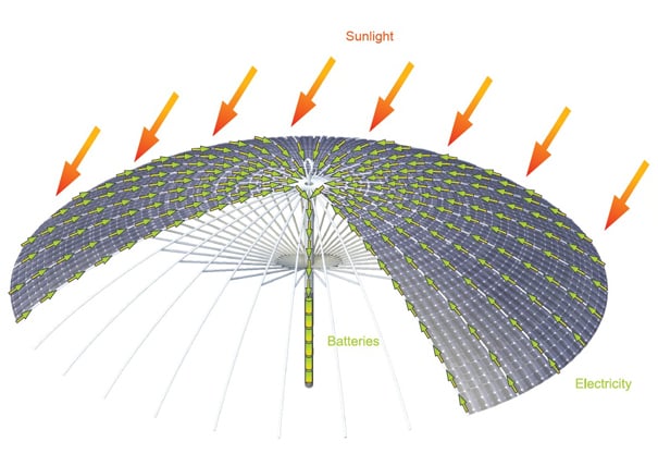
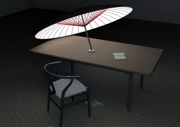
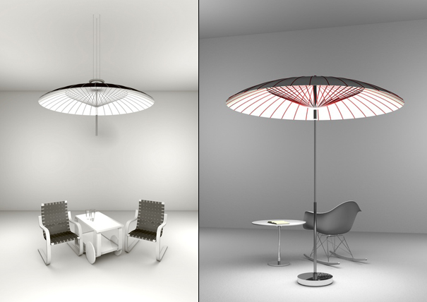
This right here is called the DSNL, aka the Day Shade Night Light, and it does exactly what it sounds like it does. During the day it blocks the sunlight, and at night, it creates light. But wait, there’s more: it’s build with two materials (mainly,) flexible solar panels and flexible organix light-emmiting diodes (OLED.) Solar power, as you can imagine, is converted from the sun and turned to electricity by the solar panels above. From there, magic.
The electricity is stored then until whenever you need it inside the umbrella frame. When the switch is turned on, the OLEDs deliver a blast of light, a unique experience of light for whatever you might need. The DSNL is the shade, then the DSNL is the light. Intensity of light can be adjusted by turning the handle. Wonderful!
Designers: Yang Ze-Siao
----------
Yanko Design
Timeless Designs - Explore wonderful concepts from around the world!
Yanko Design Store - We are about more than just concepts. See what's hot at the YD Store!
studio allternatives: swinging chairs
by: Designboom - Weblog, 2010-11-14 15:02:00 UTC

this slow swing chair, made from bamboo, steel flat bar and 12 nut-bolts, is designed to be used on a verandah.
its swinging properties come from its curved frame and cantilevered construction.
alternatively, the form can be reversed and used as a low seating chair.
read more
Chevy Cruze Eco Gets a 42 MPG Rating
by: Eco Geek Latest, 2010-11-15 16:41:30 UTC

The "eco" version of the Chevy Cruze has scored a 42 MPG rating from the EPA for highway driving. This is notable because the Cruze Eco is neither a hybrid nor a tiny compact car. It's a decent-sized sedan and the fuel savings came from several efficiency tweaks on the part of GM that could be used in all cars to get much higher mpg.
Aerodynamic improvements added six mpg on their own, inlcuding: more closeouts on the upper grille, a lower front air dam extension, a rear spoiler, lowered ride height, underbody panels that refine the air flow under the car, a front grille shutter that closes at high speeds to reduce drag, but opens to allow airflow to cool the engine, and the use of ultra-low rolling resistance tires. These improvements were all born from wind tunnel testing done on the Volt, which has a similar body to the Cruze.
The other focus, as you've probably guessed, is weight reduction. Forty-two changes were made that lead to a weight reduction of 214 pounds compared to the Cruze 1LT.
The Cruze Eco comes with a Ecotec 1.4L turbocharged engine and six-speed transmission that's gears are optimized for efficiency, reducing rpm on the highway and reducing fuel use.
These tweaks have allowed the Cruze Eco to jump over efficiency leaders in its class in highway mpg like the Toyota Corolla (35 MPG), Honda Civic (34 MPG) and Ford Focus (35 MPG). In highway ratings, it also surpasses hybrid models of the Ford Focus (36 MPG), Nissan Altima (33 MPG) and Toyota Camry (34 MPG).
via GM
 How the Nest Collective Is Making Healthy Children's Food Fun
by: fast company, 2010-11-12 22:25:37 UTC
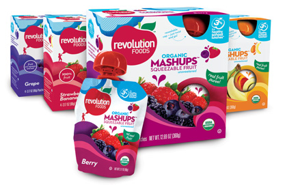
Junk food is easy to sell to children; even if their parents don't want them to have that bag of Cheetos in the snack food aisle, kids will find a way to get a hold of it. But coming up with healthy food that both parents and kids will enjoy? That's not a simple task. Nest Collective, an accelerator for wellness food brands geared toward kids, is making a go of it with two brands: Plum Organics and Revolution Foods.
Nest was created by Sheryl O'Loughlin and Neil Grimmer in 2007. The pair, both of whom are busy parents, wanted to acquire brands that spoke to their passions. "We want the best food for our kids, but the marketplace doesn't have organic, healthy, yummy products out there," O'Loughlin explains. "When we started out, we were looking for beautiful brands with a story." So Sheryl (the former CEO of Clif Bar), and Neil (a former senior designer at IDEO) snapped up both Revolution and Plum.
The reason: "Older-school brand like Gerber have products for everything from babies to toddlers, but there are no
brands serving that role for the modern parent with sensibilities in style and
design," she says.
Revolution Foods is dedicated to bringing healthy, tasty food to school lunchboxes. The tactic makes sense, O'Loughlin explains, because 50% of kids bring their lunch to school. Among Revolution's more creative offerings: the Jammy Sammy (a snack-sized sandwich bar), the Grammy Sammy (a yogurt-filled sandwich bar), and Mashups (organic squeezable fruit). The clever names and fun packaging are key to attracting customers--and it helps that the products are tasty, too. "We continue to build our portfolio with food that tastes really, really good," O'Loughlin says.
Nest's most successful venture thus far has been with Plum Organics, now the leading organic baby food brand in the U.S. Nest ditched the traditional baby food jars for Plum, opting instead to use pouches that are both convenient and portable. According to O'Loughlin, the packages have a much lighter footprint than jars do--pouches are lighter and smaller than jars, so they require less fuel when being transported by truck.
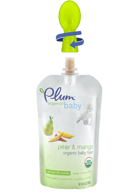
Nest's other big innovation with Plum is the Plum Dispensing Spoon, a one-handed baby food-dispensing spoon that attaches to Plum's baby food pouches. Nest developed the concept and brought it to market in just six months.
When Nest started in 2007, organic, healthy children's food was still something of a novelty. That's not the case anymore. It's been a little bit of a wake-up call," O'Loughlin says. "We're figuring out how to put our stake in the ground now and secure leadership in these categories."
Judging by Plum and Revolution's past successes, it shouldn't be too difficult. "We don't have the deep pockets, so we want to keep it simple, do it fast, and do it through innovation," O'Loughlin says.


 piet hein eek: scrapwood wallpaper
by: Designboom - Weblog, 2010-11-10 16:51:00 UTC

'scrapwood wallpaper' emulates real planks of wood
on paper for a rustic wallcovering. each roll contains 4m² of unique
scrapwood to transform your walls.
read more
yuki yamamoto: reline
by: Designboom - Weblog, 2010-11-11 16:50:00 UTC

'reline' series of chairs are derived from mathematical equations
which are transformed from originally two-dimentional curves, defined and projected into 3D
forming the frame of the chairs.
read more
The Story of Electronics by Annie Leonard (Video)
by: TreeHugger Design, 2010-11-12 17:51:43 UTC
 Image: The Story of Stuff Project
"Why Designed for the Dump is Toxic for People and the Planet"
There's a new addition to the series of short animated films made by
The Story of Stuff Project, Annie Leonard's brainchild. If you're not familiar with it, check out
this great overview post that Chris wrote a few months ago. The latest installment in the series is about electronics; how they're designed, made, used, and disposed of,...
Read the full story on TreeHugger
Carry Your House on Your Back With The Wearable Tent
by: TreeHugger Design, 2010-11-11 14:14:54 UTC

Image source:
Livedoorbiz
Ever since Archigram presented the Suitaloon in 1968, (shown below fold), ideas have been put forward for minimalist shelters that one can carry on their back. This looks like just about the simplest one yet- a poncho designed to turn into a tent, from a
Japanese source via
Geekologie.
...
Read the full story on TreeHugger
The Green Workplace Looks At Eco-Labels
by: TreeHugger Design, 2010-11-12 14:51:11 UTC
 The Green Workplace
 is starting an interesting series on Eco-labels and Certification related to the construction industry. Leigh Stringer, VP of HOK (and author of
The Green Workplace) and designer Deborah Fuller are starting right at the beginning. It is an important issue; as
Shane McQuade said in a guest post, they are "a confusing landscape for consumers, and a nightmare for manufacturer...
Read the full story on TreeHugger
28 years later, World's First Laptop still looks freaking cool; Bill Moggridge's machine is the Blade Runner of the computer world
by: Core77, 2010-11-11 16:12:41 UTC
That's the GRiD Compass, the first clamshell computer anyone had ever seen, designed by Bill Moggridge for his very first California client, GRiD Systems. Before anyone had coined the phrase "laptop" or figured out what one should look like, Moggridge worked it out.
[GRiD CEO John] Ellenby's idea was to create a computer with an electronic display that would be small enough to carry around, but powerful enough to complete work tasks away from the office. Moggridge began to visualise a design for this device in order to help people understand what the product would look like and to convince venture capitalists and potential employees of its viability and appeal.
...The impact of the Compass Computer in the world of computing is obvious: it was the world's first laptop. Its geometry, layout and clamshell mechanism have been imitated time and again on all manner of portable computing and communications devices. Many of Moggridge's ideas for the physical design of the Compass Computer were unique at the time, but have since become commonplace: the flat electroluminescent graphic display, the low profile keyboard and the die-cast magnesium enclosure, for example.

Nearly three decades later, Moggridge has been awarded the UK Design Council's 2010 Prince Philip Designers Prize, which "honours British designers who have most influenced and shaped daily lives."
(By the by, the topmost photo is the very first GRiD Compass computer, from 1982; the second photo is version 2.0, from 1984.)
You can download an MP3 of Moggridge being interviewed by Design Observer's Debbie Millman here.
(more...)






Comments by our Users
Be the first to write a comment for this item.